Case StudiesCase study
Feeling Good
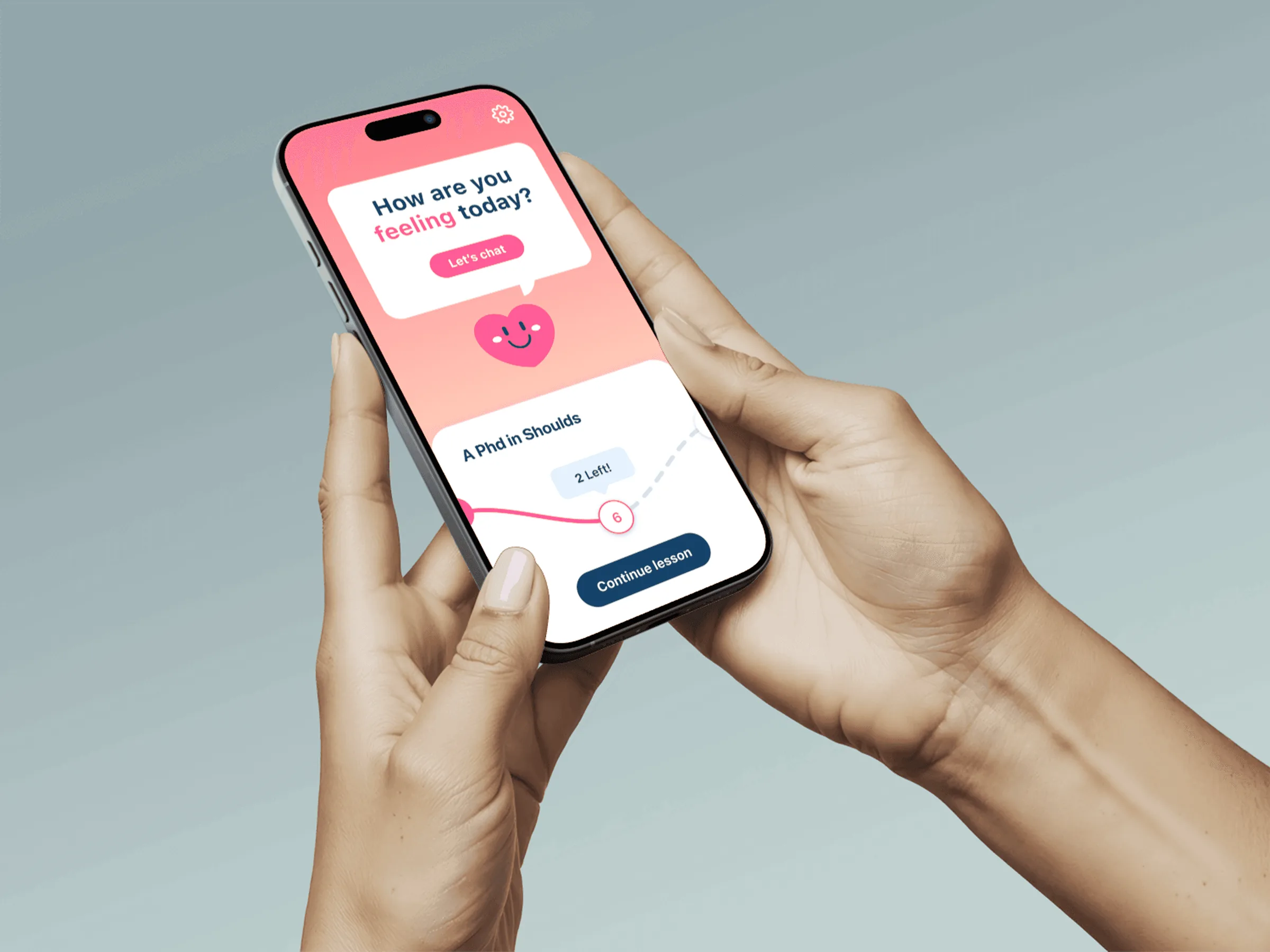
Feeling Good is a mobile app that teaches the Cognitive Behavioral Therapy techniques from Dr. David Burns' book Feeling Great. I was its Founding Designer, from concept to launch. The people I interviewed believed in the book and had trouble using it, so I rebuilt the app around that.
The problem
People believed in the book the app is built on. Many of them had trouble putting its techniques to use.
What I did
Interviewed 30+ people, then rebuilt the app to open on a question, put lessons on one path, and measure how people feel before and after a session.
What it came to
- $5M+Funding goal exceeded
- 1k+On the waitlist
- 90%Improved feelings
01 / The gap
People believed the book. They couldn't use it.
Before I changed anything I interviewed more than 30 potential users. I asked about their main challenges, how they lived, and what the book had done for them.
Two of the three things I heard were about what people were dealing with. The third was about the product, and it decided most of what follows.
30+ interviews, three findings
The techniques worked. Getting to them was the hard part.
Every participant
DepressionIt came up with everyone I interviewed, so support for it had to be in the app from the start.Second most common
AnxietyThe next most common thing people were dealing with, and it needed features of its own.Many
Difficulty using CBTPeople had trouble putting the strategies in Feeling Great to use. This was the opening for the app: make the techniques simpler and easier to reach.02 / The job
Founding designer, from concept to launch
I owned the design strategy and the product vision, and led all of the design work.
Mine
- User experience, interface design and product management
- The core flows: onboarding and the daily-use experience
- The web and mobile design system, built from scratch
- The research: 30+ user interviews
- Hiring and mentoring the design team
With
- Licensed psychologists, so the product stayed inside its clinical requirements
- The designers I hired
03 / Goals
What the company needed from it
Three things. The results further down are set against them.
Goal 1
Funding$5 million from strategic investors.Goal 2
A revenue modelFreemium: the essentials free, premium features worth upgrading for.Goal 3
RetentionPeople who stay because the app keeps being useful to them.
The case for making it accessible started from three numbers.
- 970 millionPeople with mental disorders
- 703,000Annual suicides
- 25 millionWithout health insurance
04 / Decisions
Four decisions, and what they cost
1. Open on a question, not a lesson.
The interface I inherited was clunky, confusing and repetitive, and nothing in it stirred delight. It was also educational content and little else. Someone opening a mental health app on a bad day isn't looking for a syllabus.
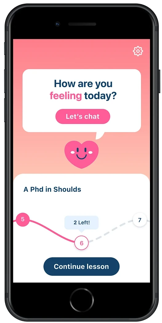
So the home screen asks one thing, "How are you feeling today?", and the answer is a button: Let's chat. Chat is the quickest way to get someone to a place where they feel good. The course is still there, directly underneath.
- Gave up
- Lessons as the first thing you see.
- Got
- An app that starts with the person, not the curriculum.
 1234
1234
The home screen
One question on top, one next step underneath.
- 1The question“How are you feeling today?” It comes from a small heart with a face, so the app reads as someone asking.
- 2Let's chatThe one action in the bubble. It leads into a conversation.
- 3The course you're inOne course by name, here “A PhD in Shoulds”, with your place on its path: lesson 5 done, lesson 6 next, 2 left.
- 4Continue lessonOne tap puts you back where you stopped.
Before
- Clunky, confusing, repetitive
- Educational content only
- Nothing in it stirred delight
After
- Opens on how you feel today
- Chat first, lessons right below
- One course, one next step
2. One path, one next step.
The lessons themselves needed a shape people would come back to. We modeled it on Duolingo, because their method is proven and it keeps people motivated: a course is a path, each lesson is a stop on it, and you always know which one is next.
- Gave up
- A home screen that shows everything there is. It shows one course and one lesson.
- Got
- Nobody has to decide where to start.
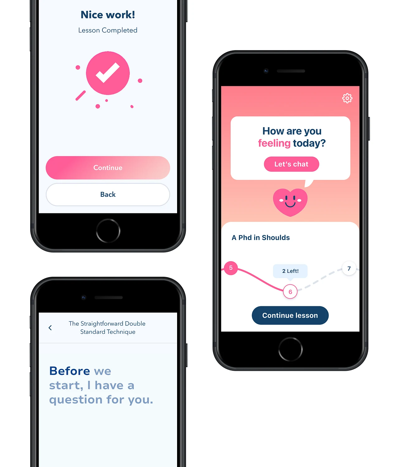
A lesson, start to finish
You can see what's done, what's next and how much is left.
- 1The pathOn the home screen: lesson 5 done, lesson 6 next, and a “2 Left!” label over it. Continue lesson is the only button.
- 2A lesson opens with a question“Before we start, I have a question for you.” This one teaches the Straightforward Double Standard Technique.
- 3It ends on a small win“Nice work! Lesson Completed”, a checkmark with a small burst around it, and Continue.
 123
123
3. Measure the feeling.
A therapy app that only counts opens can't tell whether it helps. We asked people how they felt before a CBT session and again after it, on a Likert scale, and tracked two things: whether positive feelings went up and whether negative feelings went down.
That gave us a number for the therapeutic benefit of the exercises, and it told us which content to improve.
- Gave up
- A shorter session. It asks you to rate how you feel, twice.
- Got
- Content judged by whether people feel better.
How a session was measured
The same scale, asked twice.
Before
Rate how you feel Five points, from feeling good to feeling bad.During
A CBT sessionOne exercise from the course.After
Rate it againThe same five points.What we kept
The shift Positive feelings upNegative feelings down
The shift went back into the content: we kept improving the exercises according to what it showed.
4. Delight, in small doses.
With the branding, the research and the interface settled, the last phase was joy. The people using this app are dealing with depression and anxiety. A product that celebrates too loudly at someone on their worst day is worse than one that says nothing.
So the delight is quiet and it sits at the edges: a sun that comes up while the app introduces itself, a heart that asks how you are, a small burst when a lesson is done. The rule was that it should uplift, never overwhelm.
The opening, in motion
Three lines, a sunrise, and a person.
- 1“Did you know?”
- 2“You can change the way you feel.”
- 3“It can happen fast.”
- 4A message from David Burns, and a button: Jump in!
What to notice: the sun rises behind the mountains as the lines arrive, one at a time. The first thing the app does is make a claim you can test, then hand you to the person who wrote the book.
05 / The system
One design system, and a way to agree on it
I built the web and mobile design system from scratch: the component libraries, the tokens, and the documentation for how it's governed.
The harder part was agreement. A startup has a lot of people with a view on how the product should look. Instead of arguing taste, I had everyone rate how well the new system matched the company's values and the look we were after, on Likert scales. It turned opinions into something we could compare, and it got everyone to agree on one system for launch.
06 / Results
What it came to
The funding goal was $5 million, and the company exceeded it. More than a thousand people joined the waitlist. The third result is the one the app exists for: 90% improved feelings.
Results
Against what the company set out to do.
- $5M+Exceeded funding goals
- 1k+Waitlisted users
- 90%Improved feelings
07 / What I took from it
The content was never the problem
The book already worked. What people were missing was a way in on a bad day and a reason to come back on a good one. Most of this project was taking a rigorous method and removing what stood between a person and their first technique.
The deck I presented this work from is still up. Feeling Good on Pitch